Dashboard Dyslexia is a piece of art made by artist Pandelune. It is Work In Progress: not finished, and not published for minting.
Inspiration and background
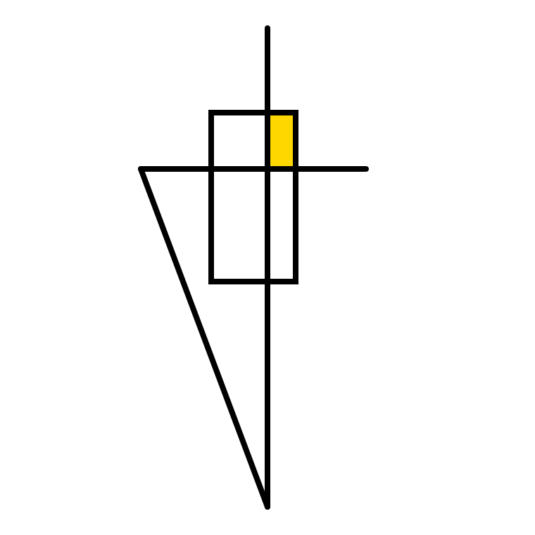
Dashboard Dyslexia represents what I see when I see corporate dashboards.
The general meaning is unclear to me. When I focus on a part of it, it does not
make any sense. And when I move my eyes to another area, it looks like it has changed.
In general, everything seems to be moving, making me dizzy. I feel lost, discouraged.
To protect myself, I consider these dashboards as pieces of art: they required
a lot of effort, they have no obvious meaning, but can be visually nice.
The roots of this piece of art are numerous. I discovered that many people do not understand charts. In fact, charts and dashboards are a very specific way to convey information, excluding many persons. Also, the complexity of corporate dashboards is endlessly growing, ending up with ridiculously complex and senseless dashboards.
A random final Dashboard Dyslexia
 Scan QR code to get URL and share
About Dashboard Dyslexia and Pandelune
About the author
I am Pandelune, the author of Orthogone, Murano Fantasy and Reverie.
As a teen, I was fascinated by the Demoscene, and by computer art in general, especially ray tracing.
When I was in high school, computers were not connected to the internet. I used to develop random based art using whatever language was available on these computers, and let it run for hours, just to impress whoever passed by. Think of random ASCII art. I'm in love with computer graphics and random numbers since then.
Follow Pandelune on twitter.
For the colors, I used the color-scheme.js library by Brian Hann.